Skip to guidelines

Brand system 1.0 / 2026

Hristo Butsev · Brand guidelines

Version 1.0
September 2026

Complex products.
Clear direction.

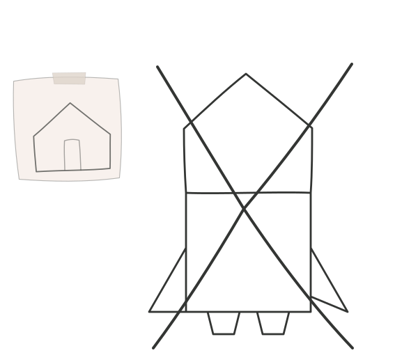
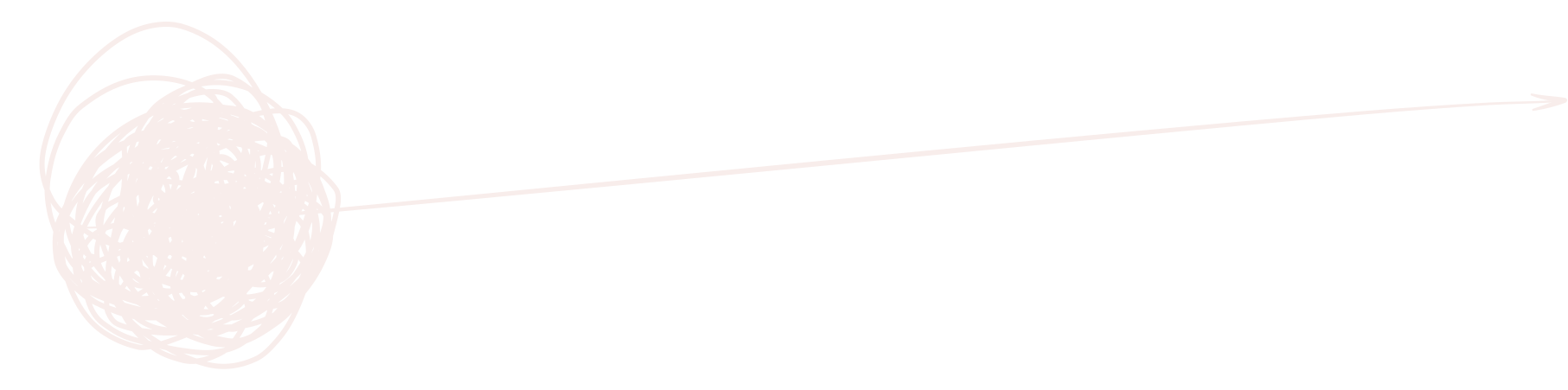
A hand-drawn tangle becoming one clear forward line

Product direction and design leadership for fintech, AI and operational software.

Read the system

Foundation

The brand starts with the product tension.

Products begin simply. Requests, workflows, exceptions, and priorities accumulate. The identity makes that familiar problem visible—then points toward direction.

Primary line

Complex products.
Clear direction.

Use this consistently. Do not invent a new tagline for every material.

Positioning

For products with too many moving parts and too much at stake.

Product direction and design leadership for fintech, AI and operational software. The work stays close to the real workflow, the people building it, and the decisions that need to hold through delivery.

Brand promise

See what’s holding your product back. Know what to do next.

Character

Specificnot generic

A real workflow with real data beats a moodboard.

Honestnot polished

The first version needs to tell the truth, not impress.

Directnot distant

Senior people stay involved in the work.

Practicalnot performative

Design is valuable when it helps a thing ship.

Clearnot simplistic

Reduce complexity without hiding the rules.

Who it is for

Products that have accumulated more than the team can explain.

  • The roadmap is full, but no bet is strong enough to commit to.
  • Every feature creates another exception or another explanation.
  • Product, design, and engineering are solving different problems.

Identity

HB. stays compact until the name is useful.

The website introduces the signature as HB. and expands it to Hristo Butsev. on hover or keyboard focus. The behaviour is restrained, useful, and part of the identity.

HB compact mark in Ink
Primary digital signature · HB.
Hristo Butsev wordmark in Paper
Expanded signature · Hristo Butsev.

The full stop

The period is part of the mark.

It closes the name with the same decisiveness the work brings to a product. Never remove, recolor, enlarge, or animate it independently.

Digital behaviour

focus / hover

Use HB. at rest. Expand to the full name on focus or hover where there is room. In static materials, choose the version that gives enough identification.

Minimum size

Wordmark
120 px / 32 mm
Compact
32 px / 9 mm
Clear space
2× the full stop

Keep the signature intact

Do not stretch, skew, outline, or shadow the mark.

Do not typeset a substitute wordmark.

Do not turn the mark Signal green.

Do not place the mark over uncontrolled detail.

Color

Neutral fields. One decisive signal.

Ink and Paper carry the brand. Signal green is rare by design: it marks the route, action, or conclusion that matters now.

Ink

#333533

Primary field · Primary text

Charcoal

#3F423F

Secondary dark surface

Paper

#F8EDEB

Primary light field

Paper dim

#E9E1DC

Secondary light surface

Graphite

#6D6D68

Supporting copy

Signal

#C8F43D

Decision · Direction · Action

InkDark field
PaperLight field
Paper dimStory field
SignalDecision

Accessible pairs

10.78:1Ink on Paper
9.70:1Ink on Signal
4.53:1Graphite on Paper · 16 px minimum

Never set Paper text on Signal. Color cannot carry meaning alone.

Typography

Aeonik carries the voice.

One family creates continuity from large product claims to careful operational detail. Scale, weight, and spacing create the hierarchy.

Aa

Aeonik

Regular 400 · Bold 700

ABCDEFGHIJKLMNOPQRSTUVWXYZ
abcdefghijklmnopqrstuvwxyz
0123456789 → ↘ ·

Display / 400 / −6.5%

Find the
constraint.

Body / 400 / −1.5%

A complex product can carry powerful rules and still feel simple. Simplicity means the logic is legible at every level.

Utility / SF Mono

40.7128° N
74.0060° W
EST 2018

Digital scale

Display64–160 px.88 line
H151–115 px.92 line
H235–77 px.98 line
H322–34 px1.08 line
Lead19–26 px1.35 line
Body16 px1.55 line
Label12 px1.20 line

Composition

Editorial precision around hand-drawn product logic.

The site alternates controlled Ink and Paper fields, oversized left-aligned type, sticky chapters, and sparse line drawings. The layout gives each product thought a full beat.

7 columns
Argument, evidence, product
5 columns
Context, caption, decision
12 / 6 / 4

Desktop, tablet, and mobile column counts.

88 rem

Default maximum content width.

8 px

Base spacing unit; 4 px for optical correction.

7 / 5

Preferred asymmetric editorial split.

Editorial

Square corners or a restrained 4–8 px radius.

Product UI

10–14 px for interactive containers.

Pills

Status

Only filters, states, and compact controls.

Graphic language

One drawing holds the whole idea.

The hero drawing is the primary brand device: an expressive knot for complex products that resolves into one long, direct line. It always appears with the two-part slogan or its meaning close by.

A hand-drawn knot resolving into a clear forward line
Complex products.Clear direction.
The animated complex-products drawing used by the website

Hero transition

The drawing reveals in pieces, then the composition pans until the forward line and “Clear direction.” take over.

The product-story sketch from the website

Product story sketches

Thin Ink lines, imperfect construction, and direct visual metaphors make product logic feel worked through rather than decorated.

Use the original hero drawing; do not redraw it as a generic wave.

Keep hand-drawn art in Ink or Paper—not Signal.

Use Signal for progress, selection, diagnosis, and action.

Sketches explain a product idea; they are not decorative icons.

Voice

Name the product situation plainly.

Direct, specific, and close to the work. The writing should make the constraint and next decision easier to see.

01Name the product situation before the service.

02Use the words customers and teams already use.

03Make the constraint visible before offering direction.

04Keep proof specific: what changed, for whom, and why.

05End with one plain next step.

Words the website does not need

innovative · seamless · delightful · cutting-edge · pixel-perfect · world-class · end-to-end

Use Specific and causal

“The roadmap is full, but no bet is strong enough to commit to.”

Avoid Polished but empty

“We create seamless experiences for innovative teams.”

Message order

1

The product situation

2

What is at stake

3

What is holding it back

4

A clear route

5

One next action

Image & motion

One portrait. Working sketches. Motion with a point.

The website uses real imagery sparingly and lets hand-drawn product metaphors carry the explanation. Motion changes the meaning of the scene rather than adding atmosphere.

Photography

Personal, not promotional.

  • Use Hristo’s real portrait or real evidence from the work.
  • Natural light, restrained grading, and decisive 4:5 crops.
  • Pair product imagery with the reason it matters.

Avoid stock teams, résumé collages, floating devices, and generic desk scenes.

Motion

Change the meaning.

  1. The knot draws itself
  2. The frame follows the line
  3. “Complex products.” recedes
  4. “Clear direction.” takes over

180 ms pieces · 8 ms stagger · cubic-bezier(.22, 1, .36, 1)

Applications

One system. Different amounts of evidence.

The identity changes density—not personality—across a proposal, case study, social post, client document, email, or product surface.

Proposal / 01

For products with too many moving parts and too much at stake.

Open with the decision, not the service list.
01 / 04

AI changes the cost of making.
Not the cost of understanding.

One claim. One Signal element. One route per carousel.
DECISION NOTE12.09.26

Reconciliation model

Keep the compact mark in the folio and the reasoning in the document.

04

Reusable presentation

12 document layouts, ready for real work.

Editable covers, summaries, decision memos, research evidence, comparisons, process pages, appendices, and closing actions. Bracketed copy marks the fields to replace.

CoverSummaryDecisionEvidenceRouteAppendix
Download editable PPTX

Digital product

The brand must still work with the mouse unplugged.

Accessibility and useful behaviour are part of the identity. A clear system is not clear if people cannot operate it.

01

One Signal action

Default to one primary action or selected route per view.

02

16 px body

Use a 16 px minimum for reading text and 44 × 44 px targets.

03

Visible focus

Use a 3 px focus outline with 3 px offset.

04

Plain recovery

Errors say what happened and how to recover.

05

More than color

Pair status color with a label, icon, shape, or pattern.

06

Reduced motion

Preserve the final state and meaning without the transition.

Production tokens

Copy these values into new digital materials before inventing local variables.

:root {
  --hb-ink: #333533;
  --hb-charcoal: #3f423f;
  --hb-paper: #f8edeb;
  --hb-paper-dim: #e9e1dc;
  --hb-graphite: #6d6d68;
  --hb-signal: #c8f43d;
  --hb-ease: cubic-bezier(.16, 1, .3, 1);
}

Asset library

Ready to use. Built to travel.

The logo files are outlined SVGs and do not require Aeonik to be installed. Keep every viewBox intact and preserve the original aspect ratio.

Source of truth

The complete written specification lives in docs/brand-guidelines.md. Vector marks can be regenerated with python3 scripts/gen-brand-vectors.py.