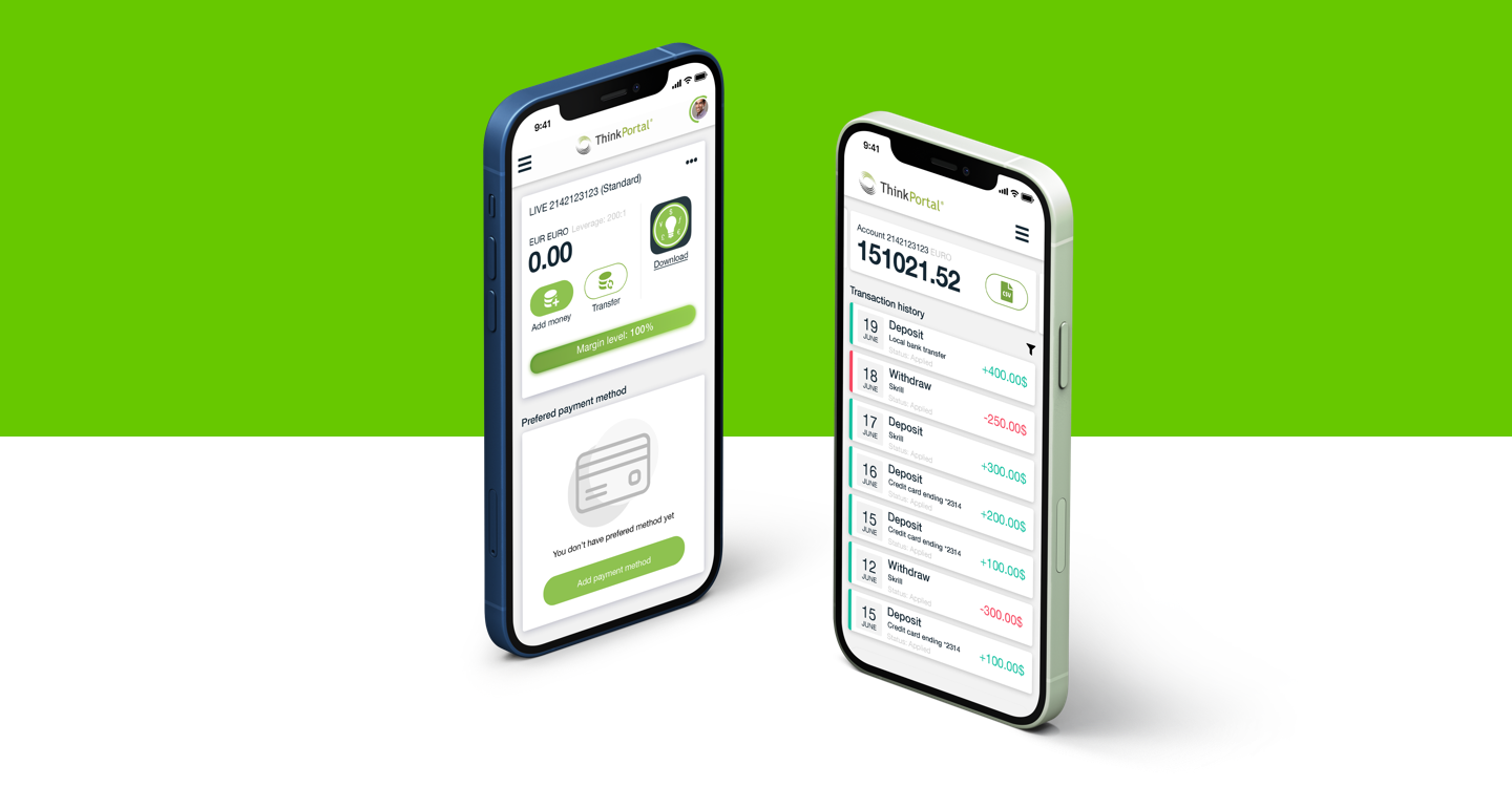
ThinkPortal
Financial web application where clients can manage their funds
The Challenge
My main objective was to create a platform which users will use on day-to-day basis giving deposit their funds and manage their accounts as well. Here trustworthy and secure was main components this product to be successful.
Building the Strategy
From beginning we start to plan how this product needs to work and look at end. Our approach combine ease of use and minimalistic design which in end will help users to navigate easily on any device and encourage them to use more platform by giving them useful insights of their financial statements and what they need to improve as well. My direct contribution here start with building from scratch first UX architecture of the platform using stakeholders requirements and see what and where we need to improve ease of use and optimise flows as well. Also, I look up into what our direct competitors do and how they build their financial portals and what is their approach for converting visitors as users. Adding up to this process was taking feedback from existing customers defining where they are struggle and where are the pain points in their usage. We ask them what they need in their day-to-day activities and what features will be good to have when they work with the platform. Our main goal was to set clear data and build around it strong UX infrastructure with clear to understand UI for any kind of devices.
Insights
What we understand was:
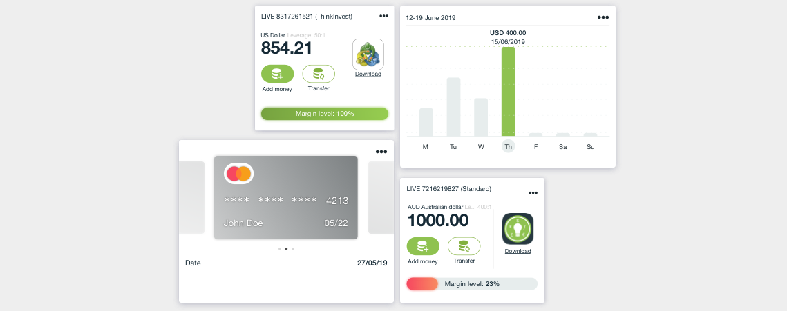
- Users want clear visible data about their accounts fund availability;
- How they perform for a specific time;
- How they can add or withdraw funds on any device;
Given the insights from the research and interviews we outline our strategy and approach for the product design. We are focused on the following design principles:
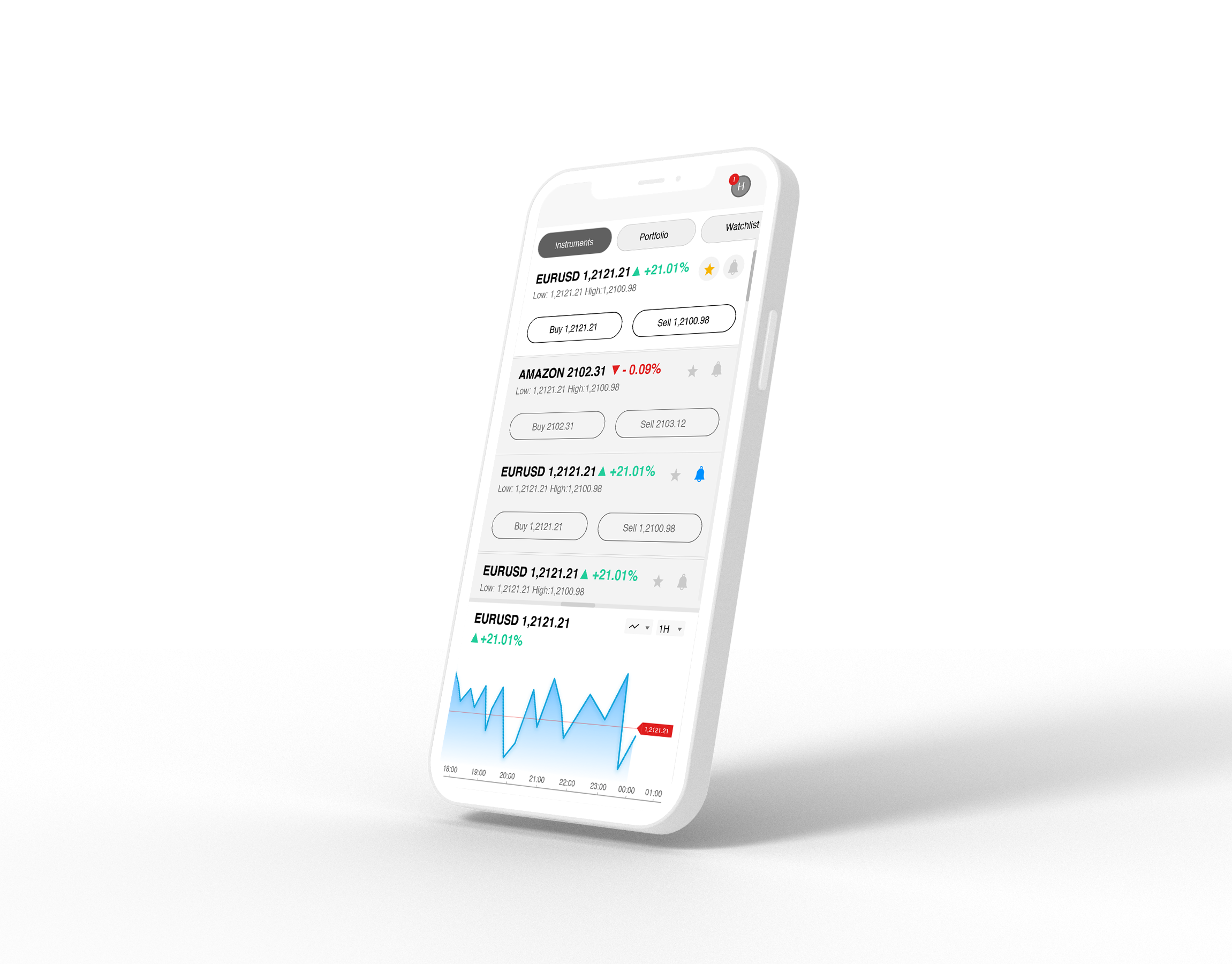
Centralization and transparency
Most people are trading with more than one account so we need to bridge tasks and critical trading information so users to need only one screen to make their trading decisions.
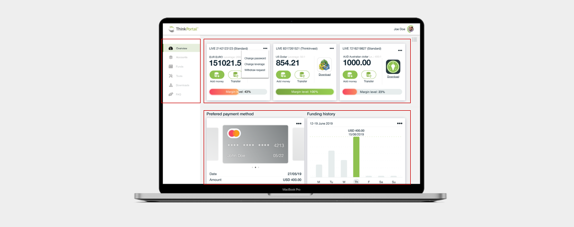
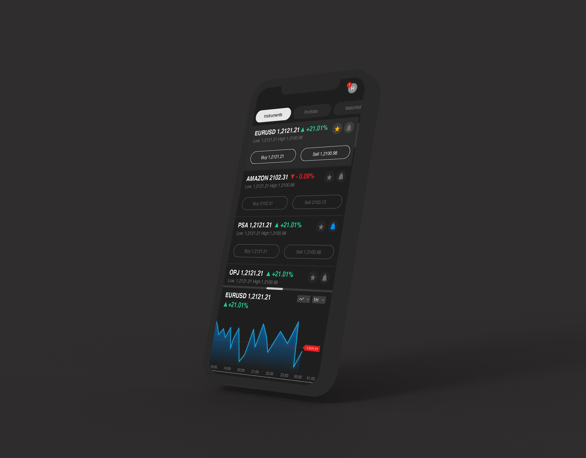
Modularity and custom approach
Different users process information different way. Empowering the users to customise their experience to fit their decision making workflow
Summary
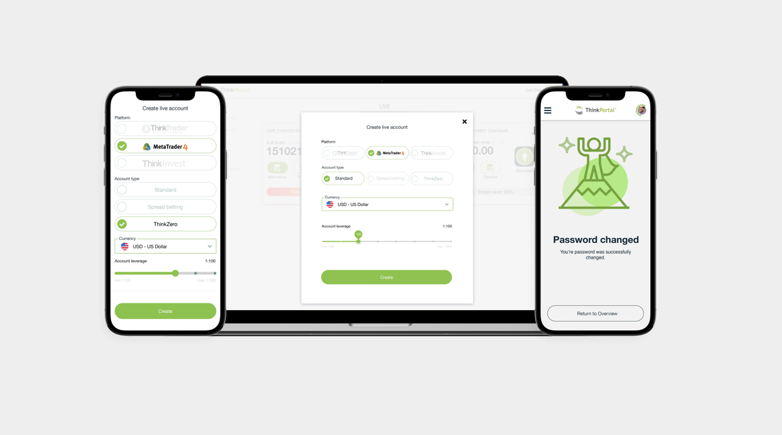
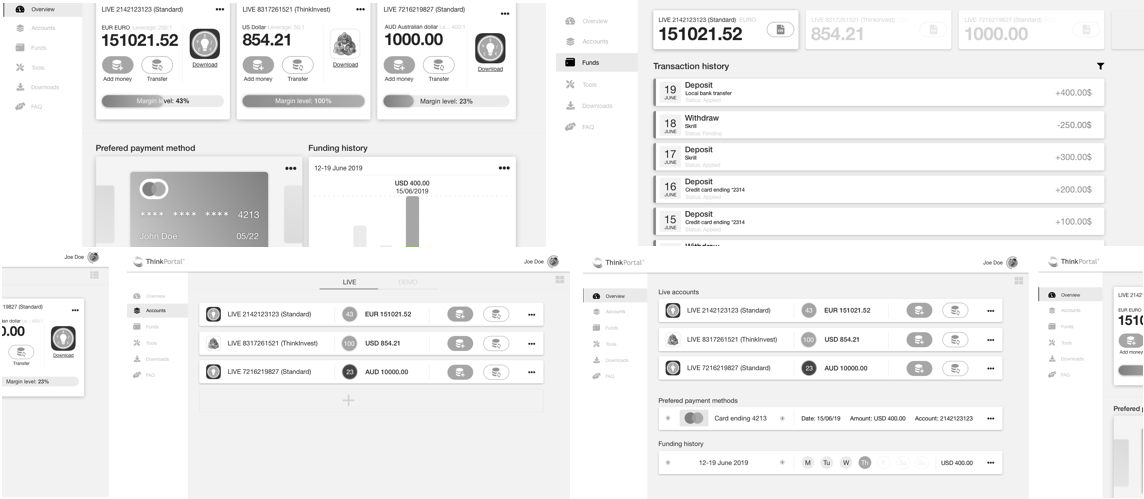
Designing a platform where users can manage multiple trading accounts in a touch of hand on different devices. We manage to create powerful dashboard with performance analytics where users can take informed decisions. User- centred design and robust visual system ensure swift and assisted task flows for effective results of the users.
Began with sketches and establish content
Process start with how we manage to fit the content within frame and group them together knowing our general visual structure. From sketches we manage turn out fast block frames to understand how things worked together with sizes same as the high fidelity wireframes
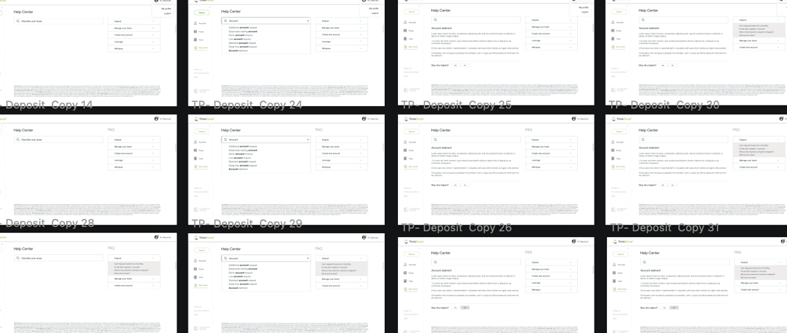
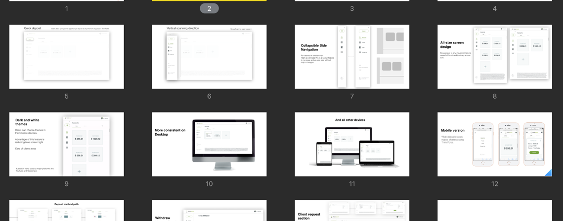
40+ High Fidelity Wireframes
After understanding the general layout and content structure, myself crafted high fidelity wireframes to slowly explore how visuals can help the cognitive demand despite the amount of information being presented in any given time. In just two weeks we produce more than forty high fidelity wireframes for different flows and experiences for the web application.
Visual Design
The visual design exploration consisted of ideation on visual experience that utilizes colour, shape, size, space that helps the user what they need to pick out relevant information and relationships without the visual noise of useless decoration while incorporating the company brand.